Creating animated bar charts to visualize sawtimber prices
April 26, 2021
analytics Data viz timber prices RIf you’re on social media, you’ve probably seen animated bar charts. My favorite is one that shows the popularity of data science software through time.
Animated bar graphs are effective when you have a categorical variable that has a different value at multiple time periods. This is why animated bar graphs work well to visualize time series data. These data might typically be represented by multiple lines on a graph that “cross” over time. Instead of a line graph, an animated bar chart ranks the order of the bars so that you can see how categories trend over time.
In this example, we’ll use animated bar graphs to see trends in prices paid for different species of sawtimber sold in Minnesota. R software will be used to develop these bar graphs. The final result will be a GIF image.
To start we’ll install the gganimate and gifski packages to help create the animated bar charts:
install.packages("gganimate")
install.packages("gifski")
We’ll load all of the libraries into R that we plan to use:
library(googlesheets4)
library(tidyverse)
library(gganimate)
library(gifski)
Sawtimber price data
The Minnesota Department of Natural Resources has monitored statewide average prices received for stumpage sold by public agencies. For the last ten years, the Stumpage Price Review and Price Index has reported trends in stumpage prices for different species.
Data from 2010 through 2019 are available here for 11 primary sawtimber species sold in Minnesota. Data were compiled from Table 3 in the Minnesota DNR report.
The data are read into R using the read_sheet() function from the googlesheets4 package:
The prices data set includes the species, year, and average stumpage price for sawtimber in $USD MBF (thousand board feet). The following data manipulation step adds a variable rank that orders the prices of the species in the data by year after calculating a relative price (Price_rel) comparing to the other species:
prices <- prices %>%
  group_by(Year) %>%
  # Rank the prices by year
  mutate(rank = rank(-Price),
         Price_rel = Price/Price[rank==1],
         Price_lbl = paste0("$ ",round(Price, 2))) %>%
  group_by(Species) %>%
  ungroup()
The first ten rows of the data (for ash species) are presented below. For example interpretation, ash was the lowest priced species in 2012 and 2013 (rank = 10) but the highest and second highest priced species in 2018 and 2019, respectively:
| Species | Year | Price | rank | Price_rel | Price_lbl |
|---|---|---|---|---|---|
| Ash | 2010 | 56.27 | 7 | 0.2314781 | $ 56.27 |
| Ash | 2011 | 58.09 | 8 | 0.2501723 | $ 58.09 |
| Ash | 2012 | 36.12 | 10 | 0.1602769 | $ 36.12 |
| Ash | 2013 | 34.06 | 10 | 0.1240621 | $ 34.06 |
| Ash | 2014 | 73.41 | 6 | 0.1784655 | $ 73.41 |
| Ash | 2015 | 54.17 | 8 | 0.2039994 | $ 54.17 |
| Ash | 2016 | 97.67 | 6 | 0.3266227 | $ 97.67 |
| Ash | 2017 | 72.20 | 7 | 0.3699529 | $ 72.2 |
| Ash | 2018 | 196.37 | 1 | 1.0000000 | $ 196.37 |
| Ash | 2019 | 149.81 | 2 | 0.7026735 | $ 149.81 |
Animated bar charts with ggplot
The development of the animated bar chart begins with creating a static visualization. The visualization p.static below uses ggplot to create a bar graph that plots the stumpage price for each species. Each species is colored differently which will aid the reader in interpreting the visualization. Several arguments are added to the theme() statement:
p.static <- ggplot(prices, aes(rank, group = Species,
                fill = as.factor(Species), color = as.factor(Species))) +
  geom_tile(aes(y = Price/2,
                height = Price,
                width = 0.9), alpha = 0.8, color = NA) +
  geom_text(aes(y = 0, label = paste(Species, " ")), vjust = 0.2, hjust = 1, size = 6) +
  geom_text(aes(y = Price, label = Price_lbl, hjust = 0), size = 6) +
  coord_flip(clip = "off", expand = FALSE) +
  scale_y_continuous(labels = scales::comma) +
  scale_x_reverse() +
  guides(color = FALSE, fill = FALSE) +
  theme(axis.line = element_blank(),
        axis.text.x = element_blank(),
        axis.text.y = element_blank(),
        axis.ticks = element_blank(),
        axis.title.x = element_blank(),
        axis.title.y = element_blank(),
        legend.position = "none",
        panel.background = element_blank(),
        panel.border = element_blank(),
        panel.grid.major = element_blank(),
        panel.grid.minor = element_blank(),
        panel.grid.major.x = element_line(size = 0.1, color = "grey"),
        panel.grid.minor.x = element_line(size = 0.1, color = "grey"),
        plot.title = element_text(size = 25),
        plot.subtitle = element_text(size=18, face = "italic", color = "grey",  hjust = 0.5, vjust = -1),
        plot.background = element_blank(),
        plot.margin = margin(4, 4, 4, 4, "cm"))
Then, the transition_states() function from the gganimate package allows you to transition between several distinct stages of the data. In our case, this will mean a new bar plot of stumpage prices in every year. The transition_length() and state_length() allow you to modify the length and pauses during the transitions:
anim <- p.static +
  transition_states(Year, transition_length = 4, state_length = 1) +
  view_follow(fixed_x = TRUE)  +
  labs(title = 'Minnesota sawtimber stumpage price ($/MBF): {closest_state}',
       subtitle  = "Source: MN DNR Public Stumpage Price Review and Price Index, 2019")
Finally the animate() function results in a producing the GIF:
animate(anim, 200, fps = 20,  width = 1200, height = 1000,
        renderer = gifski_renderer("gganim.gif"))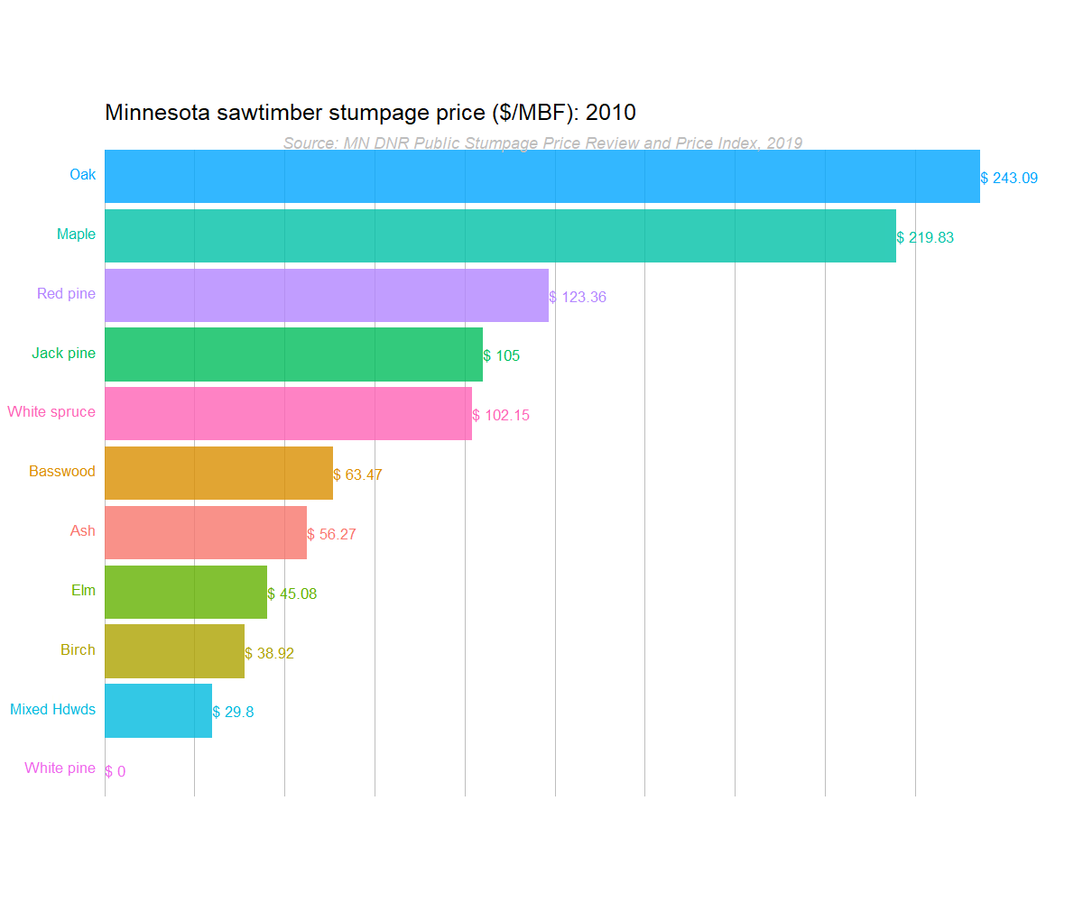
The animated bar plots reveal a number of trends that are otherwise difficult to discern by looking at the data in a table or static figure:
- The price of ash sawlogs jumps to number one. Ash is mostly a low-valued species until 2018 when it jumps to the highest price of all species. This is somewhat of a surprise because the emerald ash borer, an invasive insect, is leading to mortality of many ash forests across Minnesota. This is likely an issue with supply and trends in emerging markets for ash forest products.
- Pine sawtimber prices are stable. Prices for red, white, and jack pine consistently rank between number three and six in price from 2010 through 2019.
- Oak and maple dominate. Prices for oak sawtimber are the highest amount of all species for almost all years. Maple see a decline in price beginning in 2018.
In summary, try adding animated bar plots to your data viz toolkit. They are effective for showing trends across time and do well in a number on online environments like social media.
–
Many thanks to Abdul Majed Raja for the inspiration and code behind this post.
By Matt Russell. Email Matt with any questions or comments. Sign up for my monthly newsletter for in-depth analysis on data and analytics in the forest products industry.