Presenting regression results better with forest plots
April 7, 2019
Data viz Regression Communicating dataI was inspired by Sara Richter’s presentation at the 2019 Conference on Statistical Practice titled “Easy Ways to Make Data Visualizations More Effective”. One of the themes I took away from Sara’s presentation was that data visualization needs to be practiced, but good data visualization doesn’t need to be difficult to be done well.
When presenting results from a regression, people often use tables. While this is good if we need the true value of something, tables may not be good if we seek to convey general trends in our results.
This is particularly true for output from regressions that contain multiple independent variables. In forestry applications, we may want to quickly understand the magnitude of these variables and which ones have the greatest impact on a variable of interest. For example, the diameter growth of a tree differs depending on various factors including the species, tree size, and the site conditions on which it is growing.
As an example, Anderson et al. fit a mixed-effects model that predicts the ten-year diameter growth of black spruce in Minnesota. They investigated five independent variables and their relationship with diameter growth, including the diameter at breast height (DBH), site index (SI), basal area in larger trees (BAL), basal area of the stand (BA), and the tree’s crown position (a dummy variable with a 1 indicating the tree is a dominant or co-dominant tree).
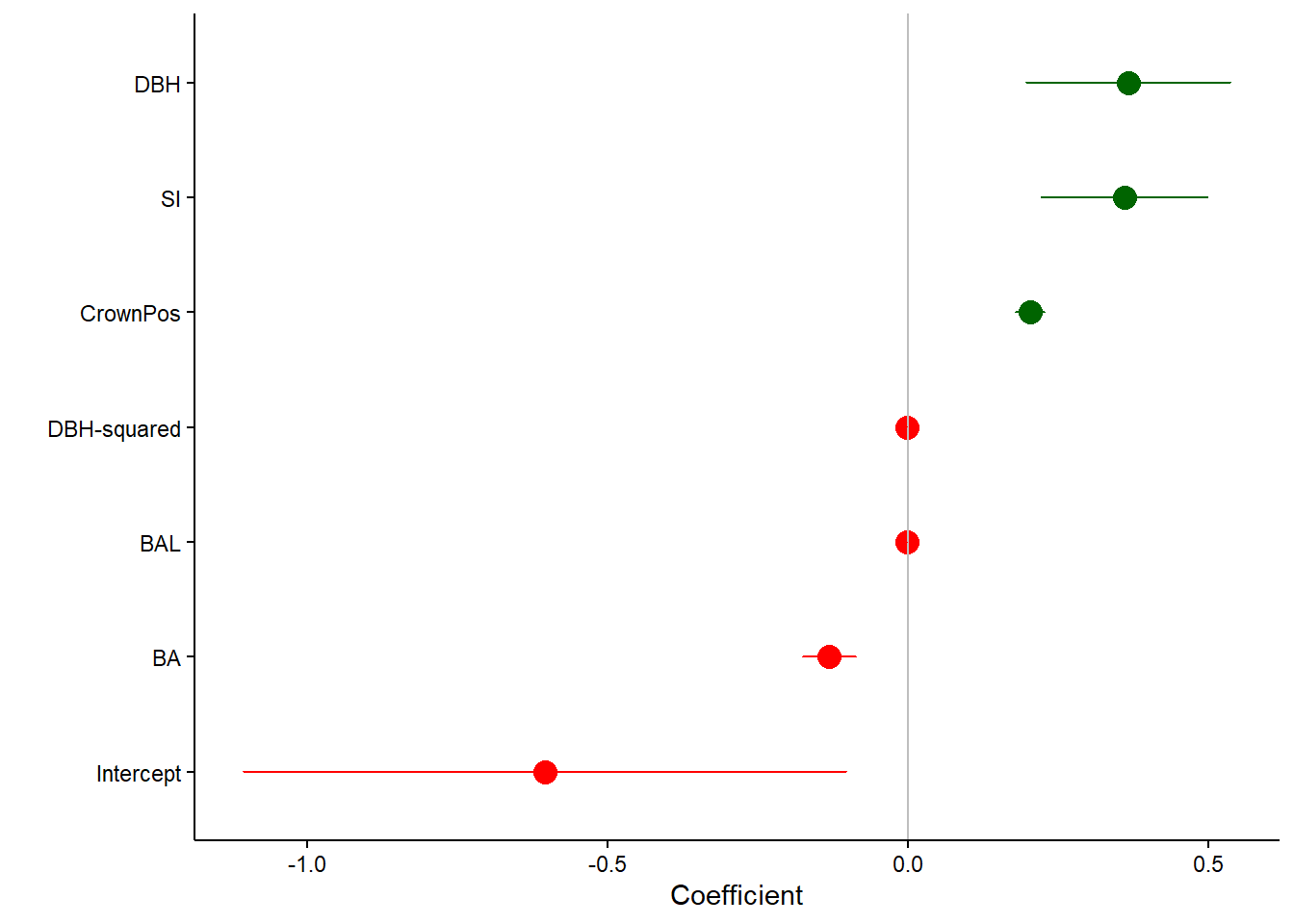
I’ve replicated their Table 4, which contains the standard output from a regression. This includes the regression coefficients and standard errors:
| Parameter | Term | Coefficient | Std. Error |
|---|---|---|---|
| \[B_{0}\] | \[{Intercept}\] | -0.6041 | 0.2558 |
| \[B_{1}\] | \[{DBH}\] | 0.3673 | 0.0865 |
| \[B_{2}\] | \[{DBH^2}\] | -0.0012 | 0.0002 |
| \[B_{3}\] | \[{log(SI-1.37)}\] | 0.3611 | 0.0703 |
| \[B_{4}\] | \[\frac{BAL^2}{log(DBH+5)}\] | -0.0011 | 0.0001 |
| \[B_{5}\] | \[\sqrt{BA}\] | -0.1303 | 0.0225 |
| \[B_{6}\] | \[{CrownPosition}\] | 0.2047 | 0.0122 |
The regression output indicates there are several variables that increase diameter growth: DBH, SI, and CrownPosition. In contrast, there are several variables that decrease diameter growth: DBH-squared, BAL, BA, and the intercept.
At first glance of the table, it’s difficult to see which variables increase or decrease diameter growth. Although the standard errors are provided in the table, it’s unclear to determine how “significant” each of the variables are, i.e., whether or not a confidence interval will contain zero.
A forest plot (or blobbogram) can be used for information that shares a similar attribute. In our case, this is the coefficient for each of the regression parameters. Other applications include using them for odds ratios in logistic regression.
We can use a forest plot to visualize the results from the black spruce regression, with different colors indicating positive and negative coefficients and whiskers representing their 95% confidence limits:
We often start our regression modeling with variables that don’t end up being significant to the model. We can also show those in a forest plot, indicating to the reader that we investigated them, but they did not contribute to the model:
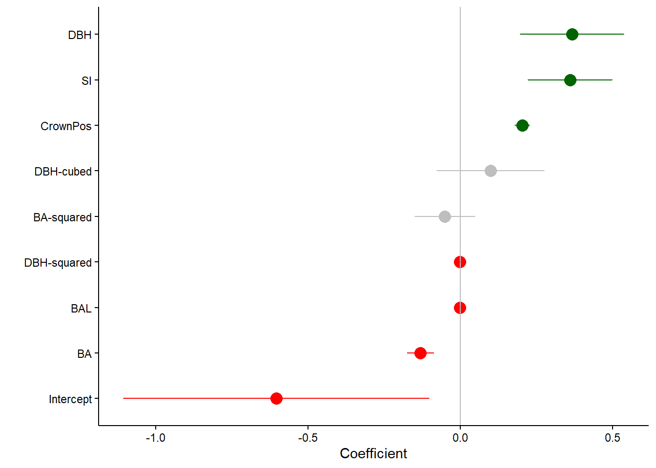
In this case, the variables DBH-cubed and BA-squared (not very biologically-important ones) were included in the model, but were not significant. This is indicated by the 95% confidence intervals that include zero (which can be deemphasized with a gray color).
Forest plots can also be used in regressions to compare different models and are always useful when comparing different values along a common scale.
By Matt Russell. Leave a comment below or email Matt with any questions or comments.