| Year | Sawtimber units | Sawtimber price (USD) | Pulpwood units | Pulpwood price (USD) |
|---|---|---|---|---|
| 2000 | Mbf | 130 | Cord | 21 |
| 2001 | Mbf | 114 | Cord | 20 |
| 2002 | Mbf | 113 | Cord | 18 |
| 2003 | Mbf | 113 | Cord | 16 |
| 2004 | Mbf | 129 | Ton | 10 |
| 2005 | Mbf | 161 | Ton | 14 |
| 2006 | Mbf | 140 | Ton | 11 |
| 2007 | Mbf | 131 | Ton | 12 |
| 2008 | Mbf | 134 | Ton | 12 |
| 2009 | Mbf | 123 | Ton | 13 |
| 2010 | Mbf | 105 | Ton | 11 |
| 2011 | Mbf | 141 | Ton | 13 |
| 2012 | Mbf | 116 | Ton | 13 |
| 2013 | Mbf | 114 | Ton | 13 |
| 2014 | Mbf | 206 | Ton | 12 |
| 2015 | Mbf | 205 | Ton | 12 |
| 2016 | Mbf | 109 | Ton | 7 |
| 2017 | Mbf | 122 | Ton | 5 |
| 2018 | Mbf | 180 | Ton | 6 |
| 2019 | Mbf | 128 | Ton | 5 |
| 2020 | Mbf | 118 | Ton | 6 |
| 2021 | Mbf | 148 | Ton | 4 |
| 2022 | Mbf | 174 | Ton | 4 |
| 2023 | Mbf | 143 | Ton | 5 |
It’s often surprising to me how little time is spent communicating data effectively. I know why, and I love this quote from the statistician Andrew Gelman:
“Anyone can run a regression or an ANOVA! Regression and ANOVA are easy. Graphics are hard.”
As I’ve written about, all good analyses start and end with visualizations. It can be frustrating when the time and effort spent in doing data analysis goes wasted when results are not presented clearly, so it’s important not to skimp on this step.
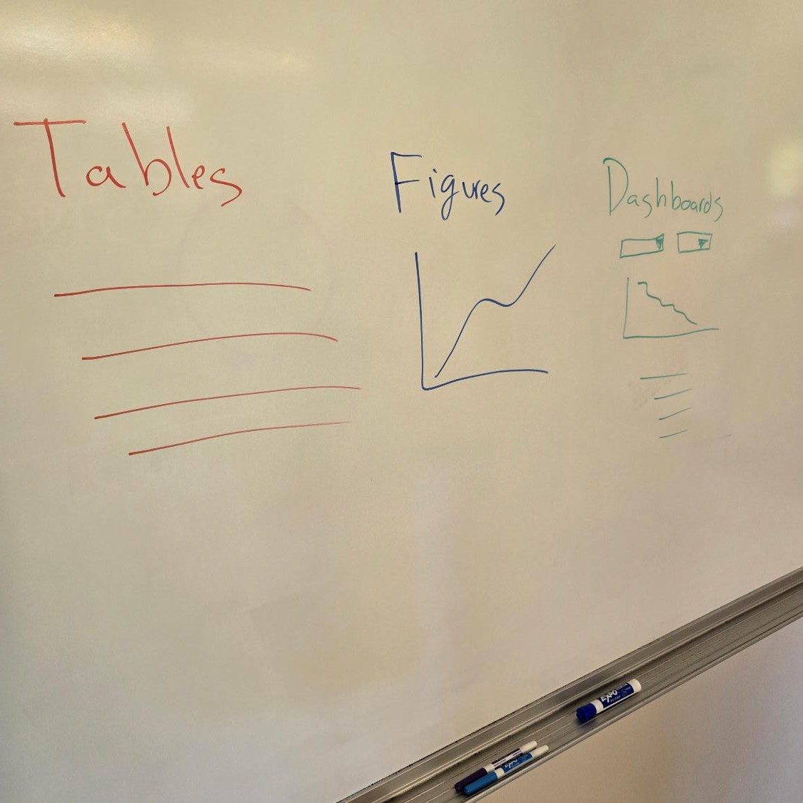
One of the most important steps in communicating data is the choice of whether to use a table, figure, or data dashboard. This post describes some examples of each, using stumpage data in Maine as an example.
When to use tables
It is best to use tables under three scenarios:
To show precise numbers or text. As an example, financial analyses across large acreages depend on precise values for prices. An analysts needs to know that to price of spruce/fir sawlogs are $143 per thousand board feet, not “about $150 per thousand”.
To compare numbers. For example, a table might show that the price of spruce/fir sawlogs is $143 per MBF, whereas eastern white pine sawlogs are $229 per MBF.
To present different kinds of information with different units of measure. For example, a table might show that the price of spruce/fir sawlogs is $143 per MBF, whereas spruce/fir pulpwood is $5 per ton.
Here’s a simple table showing eastern white pine stumpage prices in Maine over the last 20+ years, using data compile from Maine Forest Service reports:
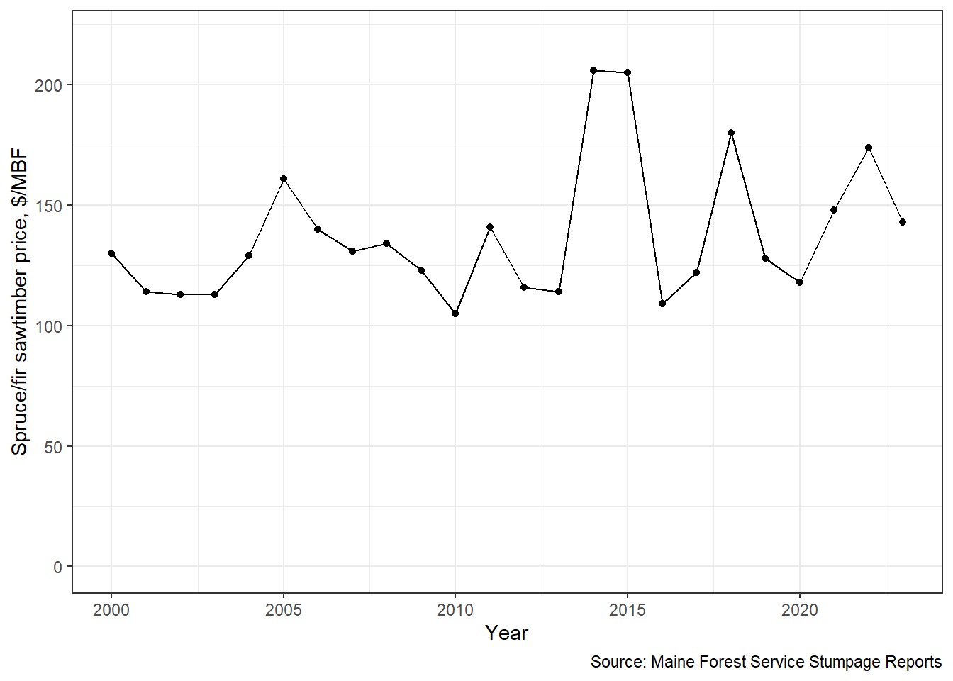
When to use figures
Figures are best used under two scenarios:
To display trends or relationships between different values through time. As an example, figures can be used to show how the price of spruce/fir pulpwood has changed over the last 20 years, or how spruce/fir compares through time with other species.
To illustrate trends when the raw values are less important.
Here’s a figure showing eastern white pine stumpage prices in Maine over the last 20+ years,
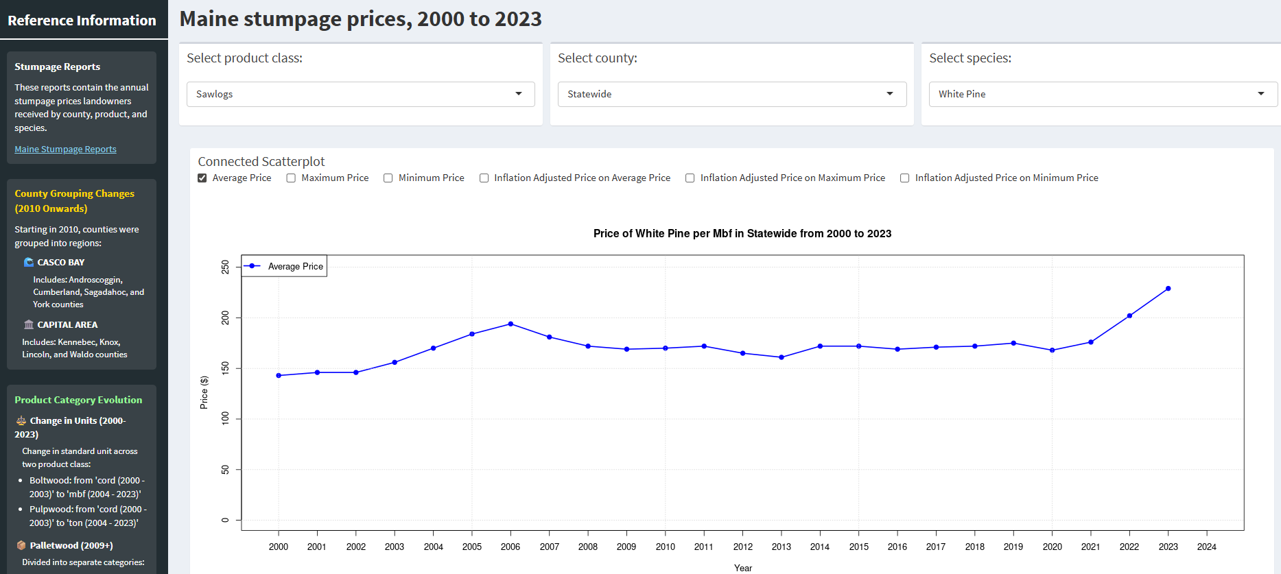
When to use data dashboards
Tables and figures are only static representations of data. Interactive data visualizations are becoming much more common to showcase forestry data. Interactive data visualizations are best used with data sets that contain a large number of observations and numerous variables.
We chose to use a data dashboard when we developed the Maine Stumpage Dashboard, an interactive dashboard that contains 20+ years of stumpage data from Maine. Not only are there multiple years of data, but also several product classes, species, units of measuring wood volume, and geographic regions of interest (e.g., counties). The dashboard will allow you to query a number of variables and allows one to look at additional price indexes, such as real or nominal prices, and average, minimum, and maximum prices:
Conclusions
Having high-quality visualizations of your analysis can lend credibility to your work. Devote time to learning good data visualization skills and practice them often to add more tools to your analytics toolbox.
–
By Matt Russell. Sign up for our monthly LinkedIn Newsletter for news, comments, and insights for professionals that work with forests and data